7 Super Simple Tips to Optimize Your WordPress Site for Mobile
Efforts to optimize your WordPress site for mobile are crucial for enhancing user experience. Mobile devices (excluding tablets) generated 58.33% of global website traffic.
That’s more than half of your potential audience accessing the web from the palm of their hands.
For WordPress site owners and admins, this is more than just a statistic; it’s a call to optimize WordPress for mobile. Your website shouldn’t only meet your users’ expectations but also exceed them.
How to Optimize Your WordPress Site for Mobile in 7 Steps
We made this comprehensive guide with expert tips for WordPress mobile optimization. You’ll learn the essentials of optimizing your WordPress site for your mobile users.
Step #1. Use a Responsive, Mobile-Friendly WordPress Theme
Ditch that clunky theme for an adaptable WordPress mobile-friendly theme that caters to your on-the-go users.
With a responsive theme, your site adapts seamlessly to different screen sizes and devices. Examples include Divi by Elegant Themes, Astra, and OceanWP.

These themes automatically adjust the layout based on the screen size. They also have touch-friendly navigation elements, like larger buttons and intuitive menus.
Pick a theme with a clean and flexible design. Look for mobile-friendly navigation menus, touch-friendly sliders, and flexible layouts.
Don’t forget image optimization features for lightning-fast load times.
A WordPress mobile-friendly theme should maintain a consistent layout, font size, and image placement across various screen sizes.
Pay attention to touch responsiveness. Buttons should be easily tappable, and menus should function seamlessly without excessive scrolling or zooming.
To ensure theme responsiveness and mobile-friendliness,
- Test the theme on multiple devices
- Ensure it’s compatible with browsers commonly used on mobile devices, such as Chrome, Safari, and Firefox
- Choose a theme optimized for speed
Step #2. Improve Mobile Page Speed
Your WordPress site’s page speed on mobile directly impacts user experience, search engine rankings, and overall site performance.
Mobile users expect fast-loading pages. Google uses page speed as a ranking factor in mobile searches, influencing your site’s visibility in search results.
To improve mobile page speed on your WordPress site,
- Optimize images by compressing and resizing them appropriately to reduce their file size
- Enable browser caching to reduce the need for the browser to download the same files during subsequent visits
- Minimize HTTP requests to decrease the load on the server and expedite page rendering
- Use CDNs so users access them from a server geographically closer to them
- Lazy load images so they load when they come into the user’s viewport
Use tools like Google PageSpeed Insights, GMetrix, and Lighthouse to test and monitor mobile page speed. They will give you insights into loading times, performance, and improvement areas.
Step #3. Enable Accelerated Mobile Pages (AMP) in WordPress
Accelerated Mobile Pages (AMP) restrict certain HTML, CSS, and JavaScript elements in WordPress.
Enabling them results in a stripped-down, mobile-optimized version of your pages that loads at warp speed on mobile devices. You’ll reduce their file sizes, allowing pages to load faster.
Enabling AMP is a breeze.
Just install the AMP for WordPress plugin.
Customize how your AMP site will be displayed. You can adjust the background color, site text, and link. However, it offers basic AMP functionalities to your site.
Check out the AMP for WP – Accelerated Mobile Pages plugins for more control and advanced features.
Step #4. Optimize Images
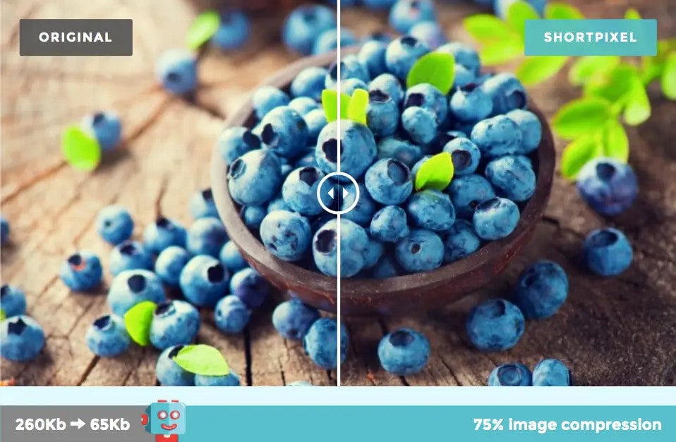
Large, uncompressed images slow down page loading times on mobile devices.
The results? A poor user experience.
Optimize images for mobile by resizing them to appropriate dimensions and compressing them without sacrificing quality.
You can easily do this using image optimization plugins for WordPress, such as ShortPixel.
Look for a plugin with
- Lossy and lossless compression options for balancing image quality and file size
- Bulk optimization to optimize all existing images in the media library with a single click
- Lazy loading so images load only as users scroll down the page
- Image resizing to ensure images are appropriately sized for various screen resolutions
- WebP format support to further reduce file sizes without sacrificing image quality
- Compatibility with page builders and themes
The best image optimization plugin compresses images without compromising quality.
Step #5. Use Mobile-Friendly WordPress Plugins
A responsive WordPress theme not an option?
Use a mobile-friendly WordPress plugin. No coding skills are required.
A plugin provides features and functionalities tailored for smaller screens. It creates a mobile-friendly version of your website.
Mobile-friendly plugins have touch-friendly navigation and can disable non-essential elements for mobile users.
Popular options include;
Look for plugins with responsive design elements like buttons and themes to ensure your site adapts to various screen sizes.
Step #6. Optimize Mobile Navigation
Nobody has time for a digital scavenger hunt.
So, trim that menu and optimize navigation elements for smaller screens. Prioritize clarity, ease of use, and efficiency.
It includes,
Using Responsive Menus
A responsive menu adapts to the device’s screen size. No more squinting or accidentally tapping the wrong links.
Prioritizing Essential Elements
Mobile screens have limited space. Focus on displaying the most critical navigation options, such as,
- Primary navigation links that lead to crucial sections of your site, such as “About Us” and “Products/Services”
- Contact information
- CTA buttons
- Social media links
- Product or service categories
- Home button
- Search bar
Using Touch-Friendly Buttons
Ensure navigation buttons and links are touch-friendly, with adequate spacing to prevent accidental clicks. Use CSS styles or plugins like WP Mobile Menu to enhance touch-friendly interactions.
Clear Calls-to-Action (CTAs)
Optimize CTAs for mobile by making them prominent and visible. Strategically place them within the mobile layout for easy access.
Plugins like MaxButtons can assist in creating attractive and mobile-responsive call-to-action buttons.
Utilize Plugins for Enhanced Navigation
Plugins like WP Mobile Menu or Responsive Menu provide additional customization options for mobile navigation.
Tailor mobile navigation experience to your site’s design with features like customization of colors, icons, and layouts.
Step #7. Regularly Test Your Mobile Site
Regular testing identifies and addresses performance issues on mobile devices, such as slow loading times or navigation challenges.
PageSpeed Insights
PageSpeed Insights evaluates a web page’s performance and user experience on mobile and desktop devices over the past 28 days.
It assesses the quality of real-user experiences based on the Core Web Vitals. Based on the web page performance, the tool then categorizes them into Good, Needs Improvement, or Poor.
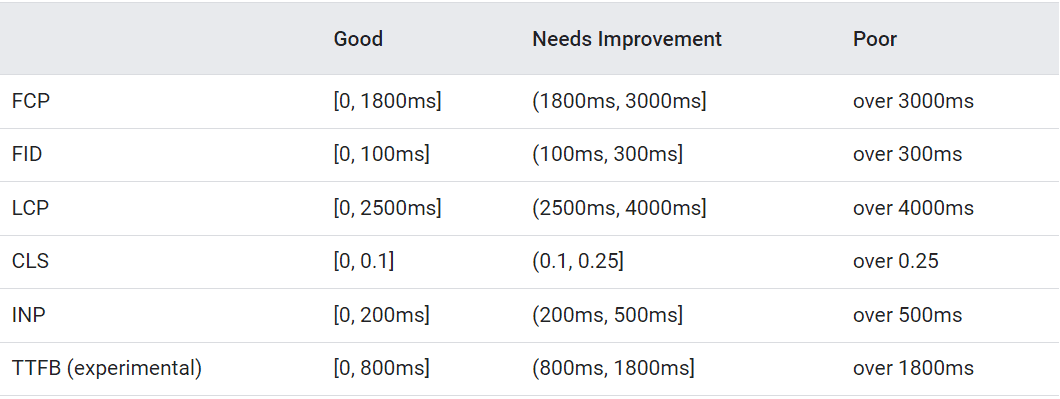
Here’s an example of insights for a website.
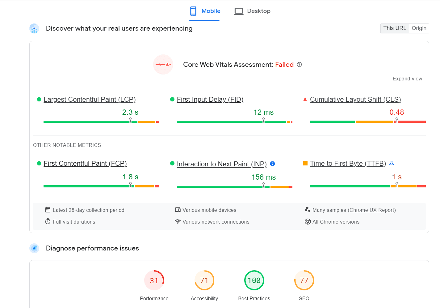
The site above failed the Core Web Vitals assessment.
PSI provides specific recommendations to improve the page’s performance on mobile.
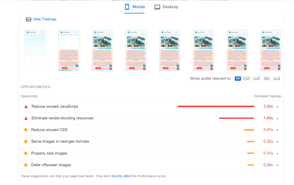
Note that PageSpeed Insights provides reports performance at the origin and page level. It’s available as an API and on the web.
Mobile Usability Reports in Google Search Console
Google Search Console helps you measure, monitor, and troubleshoot your site’s performance and search traffic.
The Mobile Usability Report shows you which pages on your site have usability issues when users view them on mobile devices. You’ll see the specific issue in detail, the pages affected by it, and how to fix it.
Common mobile usability problems include
- Incompatible plugins not supported by most mobile browsers
- Viewport not set, which tells browsers how to adjust the page’s dimensions to fit mobile device screen size
- Viewport not set to”device-width,” meaning it can’t adjust for different screen sizes
- Text too small to read
- Content wider than the screen
- Clickable elements like buttons and navigational links too close together
Unlike PageSpeed Insights, you can only use Search Console with sites you have verified ownership of. It also includes historical performance data.
Chrome Lighthouse
Previously, we used the Google Mobile-Friendly Test to test if a page is mobile-friendly. The tool will be retired on 1st December 2023.
To test a page’s mobile usability, use Chrome Lighthouse.
Lighthouse tests and audits your page’s performance, accessibility, and more on different devices, including mobile.
To test a page’s mobile friendliness on Lighthouse, load the page you want to assess on Google Chrome.
Click on the three-dot menu at the top right corner of the screen. Click “More Tools”>Developer Tools. A new window will open. Select “Lighthouse” at the top, next to “Elements” and “Console.”
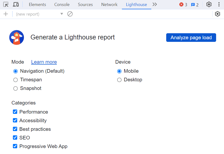
Select the type of device (in this case, mobile) and the category you want to optimize for mobile, then click on “Analyze Page Load.”
Here’s an example of a page we analyzed.
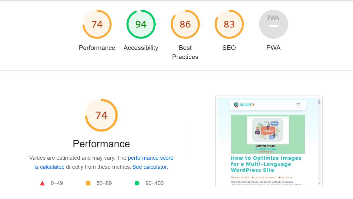
Lighthouse also uses Core Web Vitals to analyze the performance of your web pages.
Your page is well-optimized if the score is between 90 and 100. If below 90, it means significant resources are slowing your page.
Lighthouse gives suggestions for optimizing WordPress for mobile and speeding up your site.
Device Emulators
Device emulators like BrowserStack mimic real devices. Test your website’s performance on different screens, resolutions, and operating systems.
You can test your site on real devices and browsers without physically possessing them.
It emulates real-world conditions, including touch inputs and network speeds. This ensures your WordPress site is responsive and functional across different mobile devices.
You’ll also identify layout inconsistencies, navigation challenges, or performance issues.
Summary
Ensuring your WordPress site is mobile-friendly is no longer on a light note. Embrace responsive design, image optimization, and the right plugins to optimize WordPress for mobile.
You’ll improve its appearance and give every visitor an immersive, lightning-fast experience.
Your audience is mobile, and it’s time to meet them where they are.
Go ahead and make your WordPress site mobile-friendly. The future of your site’s success is mobile.