9 Best Practices to Optimize WordPress Images for Mobile Devices
Yesterday, the world said the future would be mobile. Today, you’re living that future with your phone.
Now, Google says 50% of your web traffic is mobile, and 63% of users will buy on a mobile-friendly site.
Images make your web pages heavy—resulting in slow page loading. You must optimize WordPress images for mobile to improve mobile browsing.
According to HTTP Archive:
- Websites on desktops average 2675.2 KB of data transfer.
- Websites on mobile average 2356.6 KB of data transfer.
WordPress image compression reduces webpage size by 50%-60% and speeds up WordPress loading for mobile devices.
Here are some simple daily tips to optimize WordPress images for mobile devices and speed up your WordPress website.
Quick Takeaways
- Mobile traffic accounts for 50% of web visits, and optimizing images on WordPress for mobile devices is essential for fast loading and a better user experience.
- Compressing, resizing, and using formats like WebP can significantly reduce image file sizes, improving load times.
- Image CDNs, lazy loading, and caching are effective methods for boosting mobile website performance.
- Mobile-friendly themes with AMP support help optimize images for mobile.
Why Optimize WordPress Images for Mobile Devices?
Just imagine an image on a 4k screen and the same image on a regular smartphone.
Would the same image look the same on both devices?
Unfortunately not!
Either the image has such a high resolution that it looks great on a 4k screen but struggles to load on a mobile screen. Alternatively, the image would look great on the phone but collapse on the 4k screen.
Thus we need to optimize WordPress images in such a balanced way that it looks great on the 4k and mobile screen.
To ensure your website loads quickly on mobile devices, it’s important to understand how to optimize images for WordPress, and why exactly you should do that.
Here are some obvious reasons for optimizing WordPress images for mobile devices:
Faster loading: 50% of the total internet users are on mobile. According to Google, 53% of mobile users will abandon a page if it takes 3+ seconds to load. You will lose customers if your website isn’t mobile-friendly. So, optimize your WordPress images to load fast on mobile devices.
UX: WordPress images that aren’t mobile-optimized load slowly. Large images will affect your user experience. Nearly 70% of customers say website speed affects their online shopping decisions. So, optimize WordPress images for mobile devices for a better user experience.
SERP: Mobile-optimized WordPress images improve SERP rankings. Search engines favor mobile-friendly sites with faster image loading and better mobile user experiences. This leads to increased visibility, organic traffic, and overall SERP performance.
SEO: Mobile-optimized WordPress images improve page loading times, bounce rates, and user experience, which boosts WordPress SEO. Besides, mobile image loading speeds improve search rankings. Fast-loading sites engage users, increasing dwell time and SEO performance.
9 Best Practices to Optimize WordPress Images for Mobile Devices
Right Image Format

Images are vital to a website and affect it in many ways. They can slow down a website but also boost its visual appeal.
Image format has a direct impact on file size and visual quality. And Mobile image optimization requires choosing the right image format.
JPEG and PNG are the most popular image formats, used on over 70% of websites. These formats are ideal for mobile device optimization due to their small sizes and fast loading.
JPEG: Choose JPEG for images that don’t require preserving all details, such as large images, banners, and illustrations.
PNG: Use PNG for images needing a transparent background or to preserve intricate details.
Make sure your images look great on mobile devices by choosing the right format.
Compress Your Image
You can barely find a web page without images. They make up 21% of the page size, increasing page size and loading time. That’s a lot!
Since nearly 40% of users abandon websites that take more than 3 seconds to load, image compression becomes essential. Compressing images can significantly reduce WordPress page size and loading time.
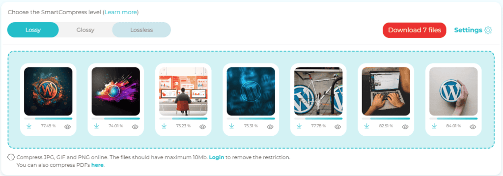
Image compression can shrink image sizes by 90%. You have 3 image compression options:
- Lossy compression: Lossy compression is the sharpest type of image compression. It sacrifices some image quality in exchange for smaller file sizes. For non-critical website images, lossy compression is best for a fast web page.
- Lossless compression: Lossless retains image quality at the expense of larger file sizes. It keeps the image density pixel by pixel with the original image. Use lossless compression for your important images.
- Glossy Compression: Glossy compression is in the middle between lossy and lossless. Glossy compression is the best option for image quality and website loading speed.
You can get all these 3 types of compression in only a few tools like Shortpixel image compression or image compression plugins to optimize your images for mobile.
Are we self-marketing? Yes, a little bit, for sure!
However, most tech giants such as Hubspot, Themeisle, Astra and Elegant Themes consider ShortPixel a top image compression tool.
Resize Images
The image size has a significant impact on the performance of your WordPress website on mobile devices. Loading times are slower for larger image sizes.
Besides, mobile devices don’t have powerful processors like computers. When the image is larger, they usually experience lag. Also, large images may require zooming in on mobile devices.
Since most themes use predefined image sizes, using extra-large images is unnecessary. Uploading large images wastes resources and slows your website.
The optimal sizes for different image types are,
- Featured image: 1200×628 px
- Portrait image: 900 x 1200 px
- Background images: 1920×1080 px
- Landscape image: 1200 x 900 px
- Thumbnails image: 150×150 px
- Logo image: 200 x 100 px
Use photo editing softwares to resize your WordPress images properly.
Use Faster-loading Image Formats: WebP or GIF
We’ve already discussed image formats such as JPEG and PNG, but what are the fastest-loading image formats for mobile devices?
WebP: WebP, a Google-developed modern image format, compresses images well and reduces file sizes by 25-35% smaller than JPEG and PNG without reducing quality.
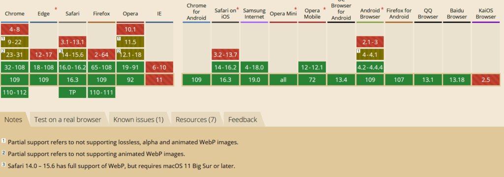
There was a concern regarding iOS not supporting WebP. But since iOS 14 and macOS 11 Big Sur, iOS supports WepbP. Converting your images to WebP format can improve loading times on compatible devices.
GIF: GIF is significantly smaller than JPEG and PNG. Yet it has one limitation that may make you struggle. GIF only supports 256 colors. But GIFs are best if you want to use shorter animations.
It’s all up to you now. You’ll get great visuals with JPEG and PNG, but the page will load slower. However, WebP and GIF will offer fast loading times at the expense of some visual quality.
Use a Content Driven Network (CDN)

When people visit your website, their browser has to download the page to display it. The distance between the hosting server and the visitor affects the download speed. Greater distance increases download and page loading times.
Here, CDNs come into play. These are servers located all over the world. For instance, If your original server is in Asia and a visitor from America accesses your site, they will be directed to a version of your website served from an American server.
Image CDNs are vital for improving mobile page loading speed by utilizing real-time image optimization techniques such as compression, resizing, and caching.
You can use popular image CDNs such as Optimole, Bunny, and Cloudflare Images to optimize WordPress images for mobile devices.
Use Lazy Loading Images
Mobile users expect web pages to load instantly after clicking on them. Thus, page loading speed is more important for mobile devices than desktop devices.
Here, lazy loading comes to the rescue. Lazy loading prevents the browser from loading the entire webpage after the initial click. Instead, it divides the web pages into pieces.
It loads only the visible and essential parts of the page and defers the remaining content until visitors scroll to view it. Hence, the page loading speed increases significantly.
You can use dedicated WordPress lazy load plugins, such as Smush, Optimole, or a3 Lazy Load, to significantly improve your website’s loading performance on mobile devices.
Use Caching
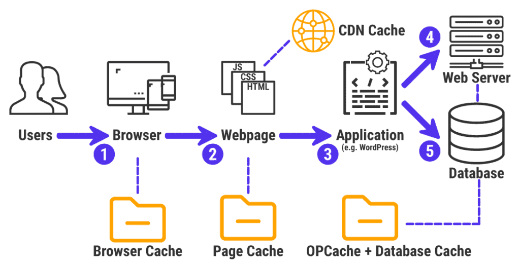
Image caching is another great way to optimize WordPress images for mobile devices. Visitors can view your website without reloading images by caching them.
Caching involves storing your website’s images in an easier and faster location for visitors, such as a third-party server near them or in their browser.
Thus, the page loading speed of your website improves significantly for visitors who do not need to reload images.
You can use cache plugins like FastPixel to cache images on your WordPress website.
Image caching improves website performance and user experience by optimizing images and other webpage elements.
Store and Use Images From External Servers
External image storage and use can greatly improve WordPress image optimization for mobile devices. This method, often used by CDNs or third-party image hosting services, improves mobile website performance.
CDNs or external servers automatically optimize images using decent lossless and lossy compression to reduce file sizes without compromising quality. These smaller image sizes result in faster downloads for mobile users, especially those with slower connections or limited data plans.
You can improve the image optimization of your WordPress website for mobile devices by storing and using images from external servers.
Use a Mobile Friendly Theme (AMP Enabled)
A mobile-friendly theme with Google’s Accelerated Mobile Pages (AMP) enabled can significantly optimize WordPress images for mobile devices.
AMP prioritizes website speed and performance on mobile devices. Thus, images on mobile devices load faster with a mobile-friendly theme that supports AMP.
You can also specify the optimal size of images for mobile devices using AMP. The user’s device receives the appropriate image size, reducing file size and loading time.
Besides, AMP-enabled themes automatically cache images. Caching stores optimized image versions in the user’s browser cache or on intermediate servers. Caching images speeds up server requests and performance.
There are numerous AMP-enabled mobile-friendly themes available. Choose one based on the requirements of your website.
Summary
Fast-loading a website on mobile is crucial. It has a significant impact on the user experience. You must optimize WordPress images for mobile devices to keep ahead of your competitors.
Beware that the smallest size loads fastest, regardless of how much effort you put in.
So, you need to keep the image files smaller to make the load faster. If done correctly, it benefits you in a variety of ways.
How do you feel about the above methods for optimizing WordPress images for mobile?
Is there anything else you’d like to bring up about optimizing WordPress images for mobile that perhaps we overlooked?
In the comments, feel free to share any suggestions or tried-and-true methods.
FAQs
How to optimize all images in WordPress?
To optimize all images in WordPress, use a plugin like ShortPixel Image Optimizer that supports bulk compression. It automatically compresses and optimizes existing images on your site with minimal effort. Simply install the plugin, configure settings, and it will handle the optimization for you, reducing file sizes without compromising quality.
What is the best image optimizer for WordPress?
The best image optimizer for WordPress is ShortPixel Image Optimizer. It offers fast and effective image compression, supporting both lossy, glossy, and lossless formats, and can reduce image sizes significantly without sacrificing quality. It also includes features like WebP and AVIF conversion, CDN support, image resizing, and automatic optimization for new images, making it a top choice for improving site speed.
Why does WordPress reduce image quality?
WordPress reduces image quality to optimize site performance. When you upload an image, WordPress automatically creates multiple sizes (like thumbnails and medium-sized versions) to fit different display needs. To save storage and improve loading times, WordPress may compress JPEG images by default, which can lower quality.
What is the best practice for images in WordPress?
The best practice for images in WordPress involves optimizing them to improve site speed and user experience. Using an image optimization plugin like ShortPixel Image Optimizer helps compress images without sacrificing quality. It’s important to choose the right format, such as JPEG for photos, PNG for transparency, and WebP for better compression. Resizing images to fit the display requirements can prevent uploading unnecessarily large files, and enabling lazy loading ensures images only load when visible, speeding up page load times. Additionally, using a CDN can serve optimized images from servers closer to users, further improving performance.
How to optimize WordPress images?
To optimize WordPress images, install an image optimization plugin like ShortPixel Image Optimizer, which automatically compresses and reduces the file size of your images without compromising quality.