Best Image Size for Websites: Dimensions, Ratio, Weight

Have you ever clicked away from a website because it took forever to load? Chances are, oversized or poorly optimized images were slowing things down.
Knowing the best image size for websites isn’t just about aesthetics. It’s about performance, user satisfaction, and even your Google ranking.
Optimizing images means finding the sweet spot between quality and file size. Good website image optimization boosts loading speeds, enhances user experience, and improves your SEO rankings.
In this quick guide, we’ll dive into stuff you need to know about website image dimensions, aspect ratios, and how to keep file sizes manageable without sacrificing quality.
Why image size matters for websites
Website speed matters. A lot.
Large images are usually the biggest culprit behind slow-loading websites, contributing to high bounce rates as impatient visitors click away.
Google also cares deeply about speed. In fact, it’s a significant factor in search rankings.
Properly optimized images can drastically cut down page load times, keeping visitors happy and helping you climb higher in search results.
Simply put, image optimization for faster websites is more than just good practice – it’s essential.
Understanding image dimensions for websites – Choosing the right size for your website
The right website image dimensions depend on their intended use.
Here are general guidelines:
- Full-width banners and hero images: Ideal dimensions range between 1280 – 1920 pixels wide (typically a 16:9 aspect ratio).
- Featured blog images: Commonly 1200×630 pixels, suitable for most layouts and social sharing.
- Thumbnails and product photos: Typically between 150×150 and 300×300 pixels square (1:1 ratio).
- Logos: Around 250×150 pixels for rectangular logos, and 100×100 pixels for square logos.
- Background images: Ideally 1920×1080 pixels or smaller, with optimized file size under 200KB.
Always match image dimensions to their displayed size to avoid unnecessary file weight.
What is aspect ratio and why is it important?
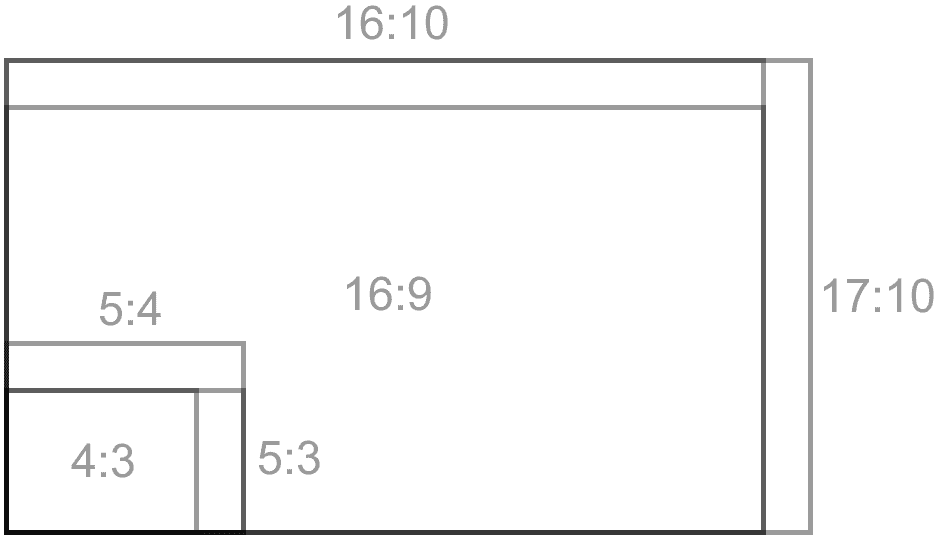
Aspect ratio is simply the relationship between an image’s width and height, like 16:9, 3:2, or 1:1.
Maintaining consistent website image aspect ratios ensures your images display correctly across various devices and screen sizes, preventing awkward cropping or distortion.

Common ratios and uses:
- 16:9 for hero images, banners, and videos.
- 3:2 for featured images in blogs and articles.
- 1:1 for product images, avatars, and thumbnails.
Consistent aspect ratios improve the visual harmony and readability of your site.
The role of file weight in website speed
File weight refers to how large the image file is, typically measured in kilobytes (KB) or megabytes (MB). Large files slow down websites significantly, affecting performance.
To keep your site running smoothly, aim to keep most images under 200KB. For smaller images, like thumbnails or icons, stay under 80KB. Background and banner images should ideally be under 200KB.
Reducing unnecessary image metadata (like EXIF data) and lowering resolution to 72 dpi (sufficient for web use) can significantly reduce file weight without impacting visual quality.
Best practices for optimizing image sizes for websites
Here are practical tips for optimizing images for web:
Resize images before uploading
To optimize loading and visual clarity, make sure your image dimensions closely match the size they’ll appear on the screen.
Start by identifying the maximum width the image will be displayed at – this depends on your website layout, device breakpoints, and any scaling effects.
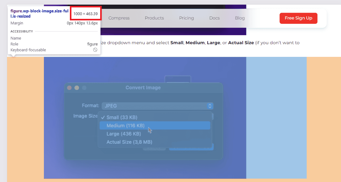
Use browser dev tools (like Chrome’s Inspect Element) to measure the rendered size of the image container in pixels. As you can see in my example above, the image container in our blog posts is 1000px wide. That means there’s no need to upload images larger than 1000px wide. They won’t display any bigger on the page, and anything larger just adds unnecessary load time.

Once you have the dimensions, save or resize your image to that width, ideally @1x or @2x for retina displays.
Don’t guess or just go with huge images and hope for the best – right-sizing your assets is key to keeping things fast and sharp.
Choose the right format
Picking the right image format directly affects load speed, visual quality, and overall site performance.
Use JPEG for rich, detailed images like landscapes, people, or anything with lots of color gradients. JPEG strikes a good balance between quality and file size, especially when fine-tuned with compression.
Use PNG or SVG for graphics that need sharp edges or transparency, like logos, icons, or UI elements. PNG is pixel-based and better for complex graphics with transparency, while SVG is vector-based, meaning it’s resolution-independent and ideal for simple shapes, icons, and illustrations. SVGs are lightweight and scale perfectly across all screen sizes, but they’re not suited for detailed images or textures.
For the best of both worlds, consider WebP or AVIF. These modern formats offer excellent compression with minimal quality loss. WebP is widely supported and often cuts file size by 25–35% compared to JPEG or PNG. AVIF compresses even better than WebP, but not all browsers support it yet, so it’s smart to have a fallback if you’re using AVIF.
Most image optimization tools and CDNs now handle format conversion automatically, but understanding the difference helps you make better decisions upfront.
Compress images
Use smart compression depending on the image type to dramatically reduce file size without a noticeable drop in quality.
In most cases, you can shrink images by 70–80%, which speeds up load times without compromising how they look.
Lossy compression works best for photos and complex visuals where slight quality reductions aren’t noticeable. For logos, icons, or graphics with flat colors, go with lossless compression to keep every pixel sharp.
Most image optimization tools let you choose the level of compression, or automatically pick the best method.
The goal isn’t to make the file as small as possible. It’s to find the smallest file size before quality takes a hit. Always preview and/or compare the result before publishing, especially if you’re compressing aggressively.
Using WordPress? Try ShortPixel!
Compress images quickly and effortlessly with ShortPixel’s plugin.
Use responsive images
Use srcset and the <picture> element to serve images tailored to each device’s screen size and resolution. This stops mobile users from downloading oversized desktop images, cutting load times and saving bandwidth.
In WordPress, plugins like ShortPixel Adaptive Images or an all-in-one solution like FastPixel automate this process for you. They serve responsive images on the fly.
This helps deliver the right size and format depending on the visitor’s device and screen, without any manual setup.
Lazy load images
Delay loading images until they’re actually visible, or close to visible, in the user’s viewport. This technique, called lazy loading, speeds up initial page load times and improves user experience by reducing the amount of data downloaded upfront.
Most modern browsers support native lazy loading with the loading="lazy" attribute, but for wider compatibility and more control, WordPress plugins can help.
Popular options like Autoptimize can automatically implement lazy loading on your site, without extra coding.
Using lazy load ensures your pages load faster and feel smoother, especially on image-heavy sites or slower connections.
Use a CDN (Content Delivery Network)
CDNs like Cloudflare speed up your site by caching images closer to your visitors around the world. This reduces latency and ensures faster delivery no matter where users are.
Many CDNs also offer on-the-fly image optimization, automatically resizing, compressing, and converting images to modern formats as they’re served.
For WordPress users, FastPixel includes built-in CDN delivery with smart optimization. They handle resizing, compression, and format conversion dynamically, so you don’t have to manage all these things yourself.
Remove unnecessary metadata
Image files often carry EXIF data (camera info, location, etc.), which isn’t needed on the web and adds weight. Tools like ShortPixel strip this automatically during optimization.
Ideal image sizes for different website elements
Here’s a straightforward image size guide for common website elements:
| Website Element | Dimensions (pixels) | Aspect Ratio | Ideal File Size |
|---|---|---|---|
| Full-width banners | 1280–1920 x 720–1080 | 16:9 | ≤200KB |
| Blog featured images | 1200 x 630 | 3:2 | ≤100KB |
| Product thumbnails | 150–300 x 150–300 | 1:1 | ≤80KB |
| Logos (rectangle) | 250 x 150 | 3:2 | ≤50KB |
| Logos (square) | 100 x 100 | 1:1 | ≤30KB |
| Full-screen backgrounds | 1920 x 1080 or 2560×1440 | 16:9 | ≤200KB |
These dimensions ensure images look sharp and load quickly.
Best tools for resizing and compressing images
Optimizing images doesn’t have to be complicated. Here are user-friendly tools you can use:
- ShortPixel: Efficient web-based tool and WordPress plugin for compressing JPEG, PNG, GIF, as well as WebP/AVIF generation.
- ImageOptim: Desktop app ideal for stripping unnecessary metadata.
- Adobe Photoshop: The “Save for Web” option lets you fine-tune compression settings.
- Canva: Great for resizing images quickly and exporting optimized files.
These tools help you achieve the perfect balance between quality and performance effortlessly.
FAQs
What’s the best image resolution for websites?
The best image resolution for websites is 72, with dimensions optimized for the specific layout, usually around 1920px wide for full-width banners. Focus on balance: sharp visuals with minimal file size for fast loading.
How small should my image file size be?
Ideally, keep image file sizes around 150 KB for standard web use. Go higher only if quality is critical, like for hero banners, but even then, stay below 300 KB when possible.
Can I use the same dimensions for desktop and mobile?
You can, but it’s not ideal. Desktop images are often too large for mobile, which can slow load times. Use responsive images to serve appropriately sized versions for different devices.
What is the ideal image size for websites?
The ideal image size depends on where it’s used. For banners, around 1500–2500px wide works well. For content images, 800–1200px is usually enough. Always aim for the smallest size that still looks sharp on the target screen.
Why is optimizing image size important for websites?
Optimizing image size improves page load speed, reduces bandwidth usage, boosts SEO, and provides a better user experience, especially on mobile or slow connections. It helps pages load faster without sacrificing visual quality.
What are responsive images?
Responsive images adapt to different screen sizes and resolutions by serving the most appropriate image version for each device. This keeps images sharp and loading times efficient across devices.
Which image format is best for websites: JPG, PNG, or WebP?
WebP is usually best for websites because it offers high quality at smaller file sizes. Use JPG for photos if WebP isn’t supported, and PNG for images needing transparency or crisp edges like icons or logos.
How do I compress images without losing quality?
Use tools like ShortPixel to compress images without visible quality loss. It applies smart optimization, such as lossy or glossy modes, to reduce file size while maintaining a clean and sharp image.
How do I test my website’s performance after optimizing images?
Use tools like Google PageSpeed Insights, GTmetrix, or Lighthouse to test your site’s performance. They show how image optimization affects load time and overall speed, plus give suggestions for further improvements.
What is the difference between image dimensions and file size?
Image dimensions refer to the width and height in pixels, which determine how big the image appears on screen. File size is the amount of data the image uses, measured in kilobytes or megabytes, affecting how fast it loads. Larger dimensions usually mean bigger file size, but compression also plays a big role.