How to Properly Size Images for Websites

If you want your website to load fast and provide a smooth experience for visitors, one of the main things you need to focus on is image optimization.
Images are often the largest files on a website, and if they’re not properly sized and optimized, they can slow down your site significantly. A slow website can lead to frustrated users, higher bounce rates, and lower SEO rankings.
In this post, we’ll go through the key factors that affect image size for websites and website performance, like image dimensions, resolution, and aspect ratios.
We’ll also talk about how to choose the right image formats for websites, best practices for resizing and compressing images, and advanced techniques like CDNs and lazy loading.
For our WordPress users, we have a dedicated guide on how to fix the properly size images warning from PageSpeed Insights.
Let’s get started with the basics of image size for websites and performance.
Quick takeaways
- Big images = slow sites; speed kills bounce rates and boosts SEO.
- Resize images to match their display size; no oversized files.
- Use 72 DPI for web images; higher resolution just bloats file size.
- Keep consistent aspect ratios to avoid distortion.
- JPEG for photos, PNG for transparency, SVG for icons, WebP/AVIF for next-gen compression.
- Hero images: 1200–1600px wide; content images: 600–800px; thumbnails: ~150px.
- Compress images with tools like ShortPixel to cut file size without big quality loss.
- Use lazy loading to delay offscreen images for faster initial load.
- Serve images through CDNs (Cloudflare, FastPixel) for faster delivery worldwide.
- Always provide fallback formats for older browsers.
- Regularly test site speed with PageSpeed Insights or GTmetrix.
Understanding image dimensions, resolution, and aspect ratios
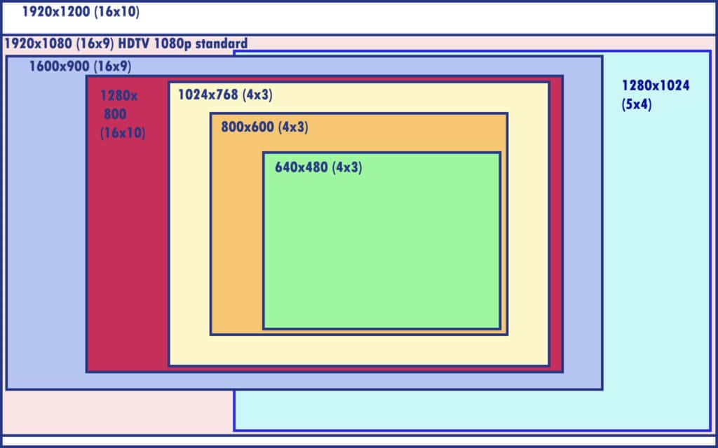
When talking about image size for websites, three things really matter: dimensions, resolution, and aspect ratio.
- Image dimensions: This refers to the width and height of an image, usually in pixels. For example, a photo might be 1200px by 800px. Larger dimensions generally mean a larger file size, which can slow down your website. To avoid this, it’s important to choose the best image dimensions for websites that fit the specific area of the website where the image will appear.
- Resolution: Resolution is how sharp an image appears, based on the number of pixels. While higher resolution gives you a crisper image, it also increases the file size. For most web images, a resolution of 72 DPI (dots per inch) works best. Anything higher is often unnecessary for web use and just adds extra weight to the file.
- Aspect ratio: Aspect ratio refers to the relationship between the width and height of an image (e.g., 16:9 or 4:3). Keeping your images consistent with the aspect ratio of the space they’ll fill on your website can help prevent distortion and ensure they display correctly.
Choosing the right image formats for web optimization
Not all image formats for websites are created equal when it comes to web performance.
Some formats are better for compressing images without losing quality, while others are better suited for certain types of images.
Here are the most commonly used image formats for websites:
- JPEG (JPG): Best for photographs and images with lots of colors. JPEGs are highly compressible, which makes them ideal for large photos. However, too much compression can reduce image quality, so it’s important to find a balance.
- PNG: Best for images with transparency (like logos) and images that need to maintain sharp edges (such as icons or text). PNG files tend to be larger than JPEGs but offer better quality for certain types of images. Optimizing PNG images is important for faster load times.
- WebP & AVIF: Newer formats that offer excellent compression and quality, making them a great choice for both photos and graphics. WebP and AVIF images are often smaller in size than JPEG or PNG while maintaining similar quality. However, not all browsers support them yet, so it’s a good idea to have a fallback option.
- SVG: A vector format that’s great for simple images, logos, and illustrations. SVGs are scalable without losing quality and tend to be lightweight.
Best image sizes for different website elements
Different parts of your website require different image sizes. Here’s a quick breakdown:
- Hero images / banners: These large images at the top of your homepage should be around 1200–1600px wide, depending on the design. This ensures they’re large enough for modern screens but not so big that they slow down loading times.
- Content Images: For images within blog posts or articles, aim for widths of 600–800px. Larger images can still be used if they’re essential, but smaller sizes will load faster.
- Thumbnails: Small images used for previews or galleries should be around 150px by 150px to keep them light.
- Icons: Icons are usually simple graphics and should be optimized to around 50px to 100px for use in menus or buttons.
How to resize and compress images for web performance
Resizing and compressing your images before uploading them is one of the easiest ways to improve your website’s speed.
Here’s how you can do it:
- Resize: You can resize images for websites in a simple photo editor like Photoshop or an online tool like ShortPixel. The goal is to resize the image to the exact dimensions needed on the site, not too big but also not too small.
- Compress: Compressing an image reduces its file size while keeping the visual quality intact. There’s always a trade-off between file size and quality, so try to find a balance that doesn’t make the image look bad.
By doing both, you can optimize images for websites without losing quality and ensure proper image sizing for website performance.
Want a step-by-step tool to simplify the process?
Here’s how to do it with ShortPixel’s Free Online Compressor:
Step 1: Open ShortPixel’s Free Online Compressor
Go to ShortPixel’s online compressor and tweak the settings as needed:
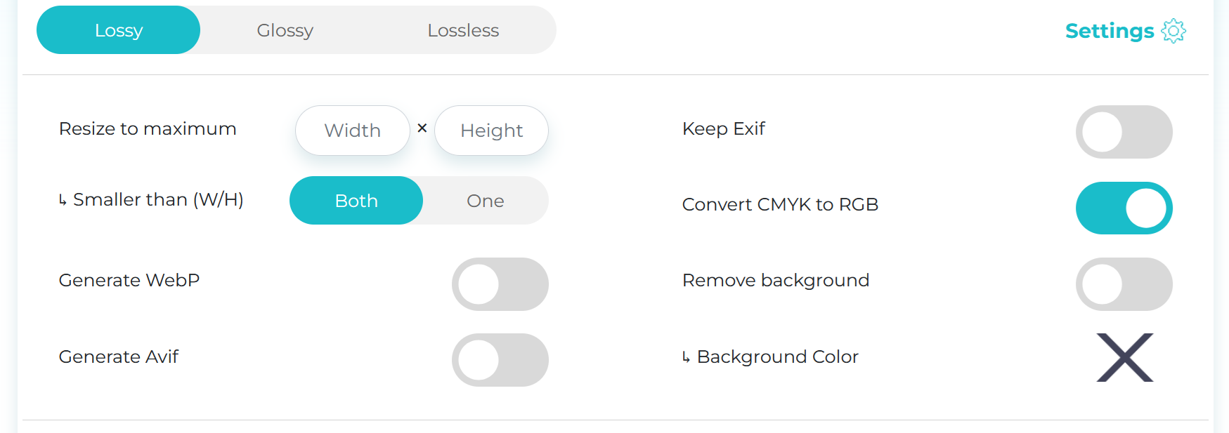
- Compression type:
- Lossy – Best for general use. Smallest file size with barely noticeable quality loss.
- Glossy – Ideal for portfolios or product images where details are important.
- Lossless – Best quality, but files are bigger. Only use when necessary.
- Resize to maximum: Want to adjust dimensions while compressing? Enter your desired max width and height here.
- Remove EXIF: Turn this off to strip extra image info like camera model, location, and settings to lower the file size. No need to keep that data unless required.
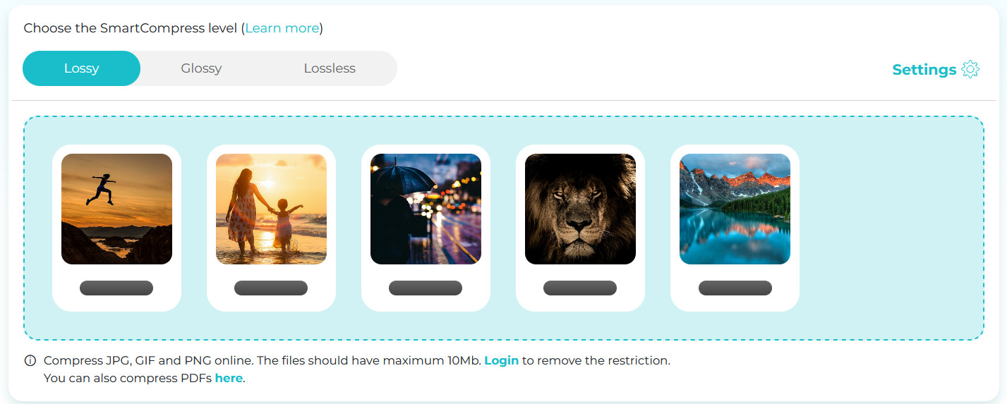
Step 2: Upload your images
Drag and drop your images into the upload box, or click to select from your device.
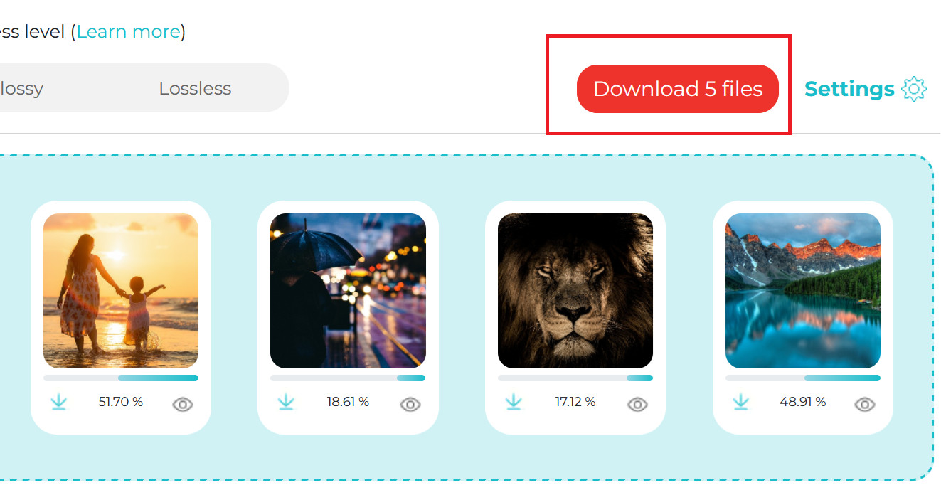
Step 3: Download the optimized files
Once the compression is done, grab them all at once in a zip file. Your images are now lean and ready!
The role of image CDNs in website speed optimization
One powerful way to improve your image loading times is by using an Image CDN (Content Delivery Network). An image CDN stores copies of your images on multiple servers across the world and serves them from the closest server to the user.
This can drastically reduce loading times for users who are far away from your main server, making your website faster no matter where the visitor is located.
FastPixel is a popular WordPress plugin that features an image CDN, caching, and advanced image optimization tools, including adaptive image resizing, lazy loading, and delivery in next-gen formats.
Using WordPress? Try FastPixel!
Properly size images and boost the performance of your website.
Lazy loading and other image optimization techniques
Lazy loading is a technique where images are only loaded when they come into the user’s view, instead of loading all images at once when the page loads.
This helps speed up page load times, especially on image-heavy websites. You can implement lazy loading with just a few lines of code or by using a plugin like WP Rocket or Autoptimize.
Testing and monitoring image performance on your website
Once you’ve optimized your images, it’s important to test how they’re performing. You can use tools like PageSpeed Insights or GTmetrix to analyze your website’s load times and see if image sizes are affecting performance.
These tools will show you not only the size of your images but also the specific areas where you can improve.

If you find that your images are still too large, consider compressing images for websites further or using a CDN to serve them faster.
Quick tips for properly sizing and optimizing images
Here are some quick tips to help you get started with image optimization:
- Always resize images for websites to fit the space they’re meant to occupy on the site.
- Use the correct image formats for websites for the type of image (JPEG for photos, PNG for transparency, etc.).
- Compress images for websites to reduce file size without sacrificing too much quality.
- Implement lazy loading to speed up initial page load times.
- Use an image CDN to serve images faster to users around the world.
- Regularly test and monitor image performance to make sure your site stays fast.
FAQs
Why is it important to properly size images for websites?
Properly sizing images for websites is important because it helps your site load faster, looks better on all devices, and reduces the amount of data users need to download, making the experience smoother and more efficient overall.
What are the best image dimensions for website images?
The best image dimensions for websites depend on where the image is used, but generally, 1920×1080 pixels works well for full-width banners, 1200×800 for content images, and 800×600 or smaller for thumbnails. Just make sure images are optimized for screen resolution and don’t exceed what’s actually needed.
How do I resize images for my website?
You can resize images for your website using tools like the ShortPixel’s Online Compressor, which lets you upload and compress images directly in your browser, or the ShortPixel Image Optimizer plugin if you’re using WordPress – it handles resizing and compressing automatically as you upload. FastPixel is also an all-in-one solution if you don’t want to worry about manual resizing.
How can I compress images for the web without losing quality?
To compress images for the web without noticeable quality loss, you can use smart tools like ShortPixel, which use advanced algorithms to shrink file size while keeping the image looking sharp and clean.
How to properly size images for a website?
To properly size images for a website, make sure they match the display size they’ll appear at – no bigger than necessary – and are optimized for web use. An all-in-one solution like FastPixel can handle resizing, compressing, and optimizing your images in one go, making the whole process fast and hassle-free.
What size should images be for website products?
For website product images, aim for around 1200×1200 pixel – this gives enough detail for zoom features while keeping file sizes manageable. Just make sure the images are square (if your layout calls for it) and optimized for fast loading.
What size should images be for website optimize?
For website optimization, images should be sized just large enough for their display area – typically around 1920px wide for hero banners, 1200px for main content images, and 400–800px for thumbnails or smaller visuals. Always compress them and use modern formats like WebP to keep file sizes low and loading speeds high.
What size should images be for website articles?
For website articles, images should typically be around 1200px wide to look good on most screens without being too heavy, and around 800px for in-line or supporting visuals. The key is balancing clarity with file size, so always optimize them for fast loading.