The Ultimate Guide to Optimizing Images for Retina Displays in WordPress

Optimizing images for Retina displays in WordPress improves the overall user experience. Retina displays are high-resolution screens with a higher pixel density than traditional displays. Images and graphics designed for traditional displays can appear pixelated or blurry when viewed on a Retina display.
It’s crucial to optimize images for Retina displays in WordPress to avoid this issue. Optimizing images for Retina displays involves creating images with a higher pixel density so they appear sharp and clear on high-resolution screens.
You can achieve this in WordPress by using images with a higher resolution and scaling them down with CSS or JavaScript.
Why Optimize Images for Retina Displays in WordPress?
There are several reasons why it’s important to optimize images for Retina displays in WordPress:
- Improved User Experience: Retina displays offer a higher-quality visual experience. Optimizing images for these displays ensures site visitors have a seamless viewing experience.
- Better Brand Perception: High-quality images help create a positive impression of your brand. Optimizing images for Retina displays in WordPress can enhance your brand’s visual identity.
- Increased Engagement: High-quality images capture visitors’ attention and increase engagement with your website’s content.
- Improved SEO: Search engines consider image quality and load times when ranking websites. Hence, optimizing images for Retina displays can also impact your website’s SEO ranking.
Comparison Between Retina and Standard Images
Retina and standard images differ in pixel density. Retina images have a higher pixel density than standard images, which means they contain more pixels per inch (PPI). This higher pixel density produces a more detailed and sharper image on high-resolution screens.
For this reason, it’s worth optimizing images for Retina displays in WordPress. Here are some key differences between Retina and standard images:
| Retina Images | Standard Images | |
| Pixel Density | At least 300 PPI | At least 100 PPI |
| Image Quality | They display more detail, color variation, and texture | They appear blurry |
| File Size | Larger file size due to higher pixels and data | Enjoy faster loading times due to smaller file size |
| Compatibility | They are compatible with high-resolution screens | They appear blurry or pixelated on Retina displays |
Understanding Pixel Per Inch (PPI)
Pixel Per Inch (PPI) is a measure of the resolution of a digital image. It describes the number of pixels contained within an inch of the image. The higher the PPI, the more pixels there are in a given image area, resulting in a higher-quality image with sharper details and smoother edges.
Pixel Per Inch (PPI) is an important consideration when optimizing images for Retina Displays in WordPress. PPI determines the quality and resolution of images displayed on the website.
When uploading an image to WordPress, the PPI should be set to the appropriate value based on its intended use. If the image will be displayed on a high-resolution Retina display, it should have a higher PPI than an image designed for a standard display.
In WordPress, the PPI of an image can be set using image editing software or plugins. Plugins adjust the PPI of images when uploaded to WordPress, ensuring they are optimized for the intended display.
It’s important to note that PPI is not the only factor determining an image’s quality in WordPress. Other factors, such as image format, compression, and file size, also affect images’ quality and loading speed on a WordPress website.
Recommended PPI for Retina Displays
The recommended PPI for Retina displays varies depending on the device. Here are the recommended PPI values for various Apple devices:
iPhone Retina Displays:
- iPhone 4, 4s: Approximately 326 PPI
- iPhone 5, 5s, SE (1st Gen): Approximately 326 PPI
- iPhone 6, 6s, 7, 8 (including Plus models): Approximately 326 PPI
- iPhone X, XS, 11 Pro: Approximately 458 PPI
- iPhone XR, 11, 12: Approximately 326 PPI
iPad Retina Displays:
- iPad 3, 4, Air, mini (1st, 2nd, and 3rd Gen): Approximately 264 PPI
- iPad Pro (9.7-inch, 10.5-inch): Approximately 264 PPI
- iPad Pro (11-inch, 12.9-inch): Approximately 264 PPI
- iPad Air (3rd Gen), iPad mini (5th Gen): Approximately 326 PPI
MacBook Retina Displays:
- MacBook Pro (13-inch, 15-inch): Approximately 227 PPI
- MacBook Pro (16-inch): Approximately 226 PPI
- MacBook Air with Retina display: Approximately 227 PPI
When preparing your images for Retina displays, it’s best to start with high-resolution images that exceed the recommended PPI. It helps provide enough pixel data for the display to render a clear image.
Also, opt for a scalable image format such as SVG since it maintains clarity regardless of the display’s resolution. Use an image compression tool to reduce file size and optimize loading speed.
WordPress Perfect Images Plugin: How It Works
Using a plugin is one of the most practical ways to optimize images for Retina displays in WordPress. The Perfect Images plugin, formerly WP Retina 2X, is perfect for making images Retina-ready without leaving WordPress.
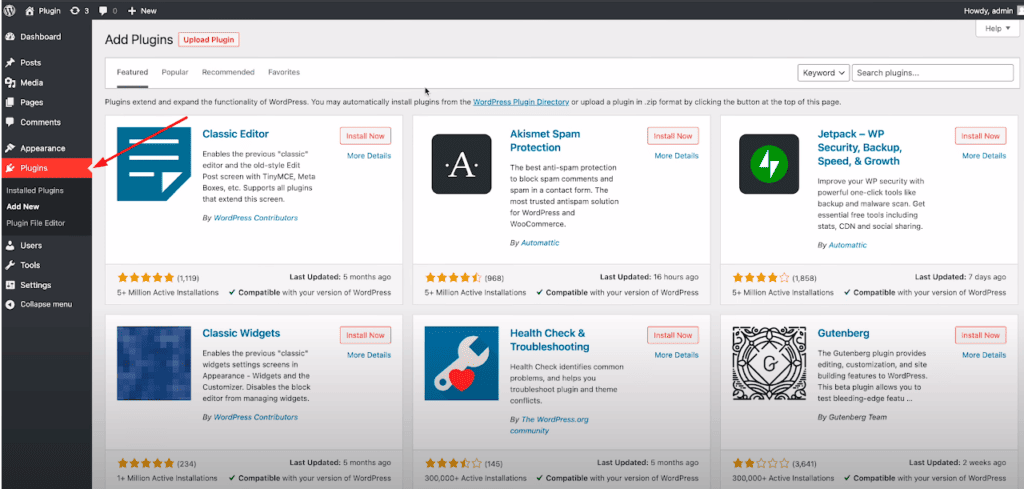
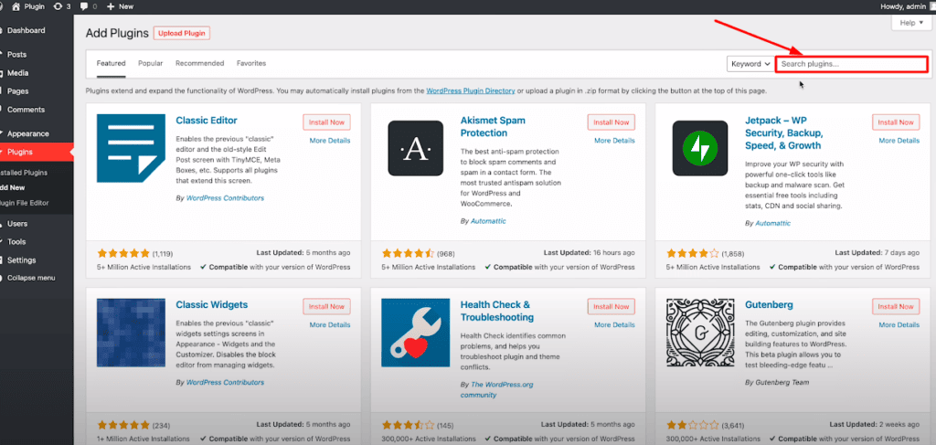
To configure the plugin, log in to your WordPress dashboard, then go to Plugins > Add New.

Next, type ‘Perfect Images plugin’ on the search bar.

Configuring Basic Settings for Retina Image Delivery
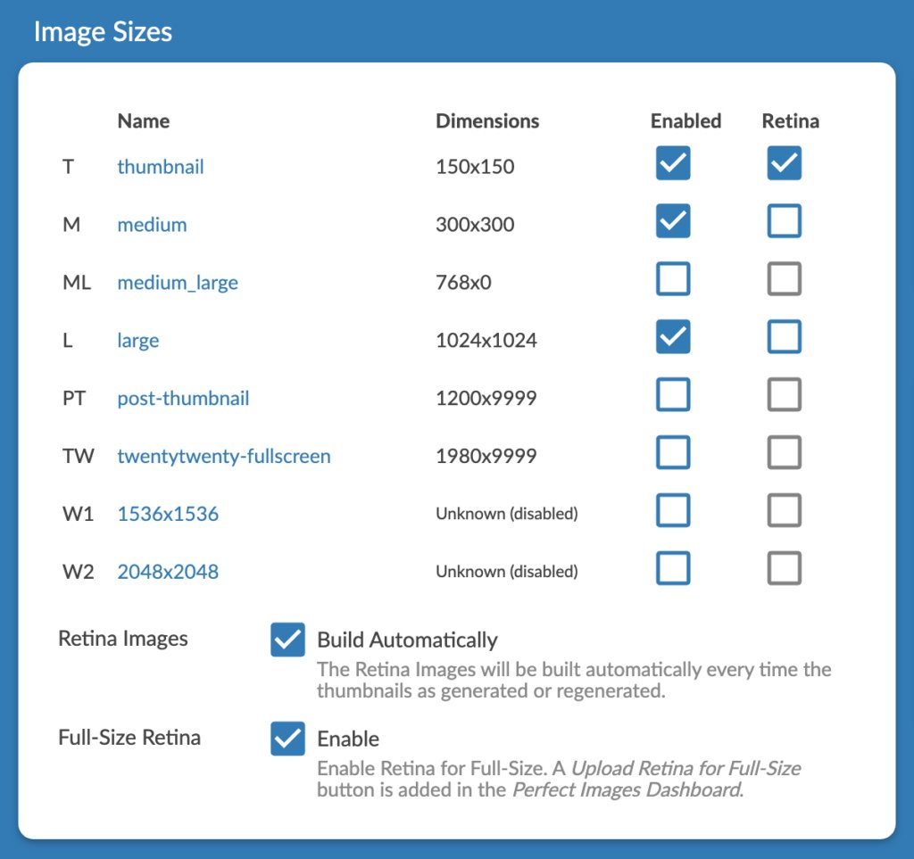
The Perfect Images plugin makes your images Retina-ready on your WordPress media library. You can turn this functionality on or off at the click of a button. The plugin lets you optimize your images for various screen sizes.

You can choose to regenerate all entries on the Perfect Images dashboard. The tool also works for a single image.

Manual Srcset Editing in WordPress
Modifying the ‘srcset’ attribute manually in WordPress allows you to optimize images based on a user’s device resolution.
Using this technique helps deliver high-quality images to users with Retina screens. It also ensures responsive image delivery for various screen sizes.
Here’s how to manually change the ‘srcset’ attribute in WordPress:
Step 1: Create Custom Image Sizes
The first step is to define custom image sizes in your theme’s ‘functions.php’ function file. These custom sizes are useful in the ‘srcset’ attribute.
Here’s how to add custom image sizes to your PHP file:
function custom_image_sizes() {
    add_image_size('regular', 800, 600, true); // Regular image size for non-Retina devices
    add_image_size('retina', 1600, 1200, true); // Retina image size for Retina devices
}
add_action('after_setup_theme', 'custom_image_sizes');
Step 2: Modify the ‘srcset’ Attribute
Locate the image you want to modify in your WordPress theme’s template file. Replacing the existing ‘<img>’ tag with a ‘<picture>’ allows you to upload image sources with different resolutions.
Here’s an example:
<picture>
    <source media="(min-width: 1200px)" srcset="image_retina.jpg 2x, image_regular.jpg 1x">
    <source media="(max-width: 1199px)" srcset="image_retina.jpg 1x, image_regular.jpg 1x">
    <img src="image_regular.jpg" alt="Image Description">
</picture>
In this example, two ‘<source>’ elements are inside the ‘<picture>’ element, each with a ‘media’ attribute. The ‘media’ attribute helps identify the screen width to be used for a respective image source.
For screen widths greater than or equal to 1200px, ‘image_retina.jpg’ is served with a density descriptor of 2X for Retina display, while ‘image_regular.jpg’ adopts a density descriptor of 1X for standard resolution devices.
Step 3: Regenerate Thumbnails
Once you’re done modifying the ‘srcset’ attribute and setting custom image sizes, you must regenerate thumbnails for existing images.
Using a plugin such as “Regenerate Thumbnails” helps ensure new image sizes are properly generated. It provides a seamless user experience across various screen sizes and resolutions.
Advanced Settings for Retina Optimization
The demand for sharper visuals is crucial for WordPress site owners. Retina displays are known for their higher pixel density than traditional screens. For this reason, there’s a need to implement responsive image techniques.
Here are two viable methods you could use to optimize your WordPress for Retina displays:
Utilizing WebP and Other Modern Image Formats for Further Optimization
WebP offers superior image compression algorithms which support both lossless and lossy techniques. The image format achieves a more significant file reduction than JPEG or PNG.
Implementing Lazy Loading to Improve Page Load Times
Lazy loading defers the loading of non-essential content, such as images after the fold, until the site visitor scrolls to that part of the page. Implementing lazy loading techniques reduces page load times while conserving bandwidth on devices with slower connections.
Best Practices for Optimizing Images for Retina Displays
Optimizing images for Retina displays can be tricky, but some best practices can help ensure your images look great on these high-resolution displays. Here are some tips for optimizing images for Retina displays:
Image Size and Dimensions for Different Retina-Supported Devices
Retina displays often have a large pixel density which ranges from 200 PPI and beyond. This makes them not appear pixelated or blurry, as with some standard displays. But, larger-resolution images have larger file sizes, leading to slower page load times. As a result, it’s best to optimize the image size and dimensions.
Minimizing Image File Size Without Compromising Quality
Images that are too large impact the website loading times and performance. It’s important to optimize images for the web by compressing them and reducing their file size without compromising on quality.
JPEG and PNG are two of the most common file formats used for images on the web. JPEG is a good choice for colorful photographs or images. PNG is better for images with transparency or a limited number of colors.
But, using the newer image format WebP is recommended for Retina displays. WebP provides better compression with smaller file size and lossless quality, ideal for optimizing images for Retina displays. WordPress provides plugins that can help to convert images to WebP format.
Regularly Testing and Auditing Retina Image Delivery on the Website
Consistent image optimization for Retina can be challenging for a busy WordPress site owner. Image dimensions, compression settings, and file settings change over time, affecting the user experience on Retina-supported displays.
Analyzing page speed metrics, such as First Contentful Paint (FCP) and Largest Contentful Paint (LCP), could help ensure images load fast and seamlessly.
Besides compression optimizations and choosing the most appropriate format (such as WebP), make sure to routinely test the performance of your site’s images on Retina displays. This helps identify recurring bottlenecks and areas where load times could be optimized.
Best Practices for Optimizing Images for Retina Displays in Ecommerce Websites
When it comes to ecommerce image optimization, ensuring that your product images are Retina-ready is a must. Customers expect sharp and clear images of products on high-resolution displays. Optimizing these images not only enhances the user experience but also helps with your site’s performance, leading to better conversion rates and faster load times.
Final thoughts
Optimizing images for retina displays in WordPress helps create a seamless user experience across various devices. If you’re using low-resolution images, they’ll appear blurry and pixelated.
Using a plugin or manually resizing your images ensures they have the highest quality possible, regardless of the device your site visitor uses. Following the tips in this guide can help you optimize images for retina displays in WordPress, improving the overall user experience.
Do you have other tips for making images Retina-ready? Please share them right in the description below.